Fig. 3.
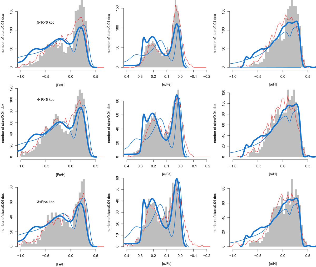
Comparisons between the model and APOGEE data in different radial bins, as indicated on the left plots. From left to right: MDF, [α/Fe]-DF, and [α/H]-DF. The APOGEE data with and without the selection in the [Fe/H]-[α/Fe] plane are shown as gray histograms and red curves. Red curves are normalized to the gray histograms. The blue thick curve is our fiducial model, the blue thin curve is the smoothed model. Both models are normalized to have the same number of stars as the data.
Current usage metrics show cumulative count of Article Views (full-text article views including HTML views, PDF and ePub downloads, according to the available data) and Abstracts Views on Vision4Press platform.
Data correspond to usage on the plateform after 2015. The current usage metrics is available 48-96 hours after online publication and is updated daily on week days.
Initial download of the metrics may take a while.