Fig. 8.
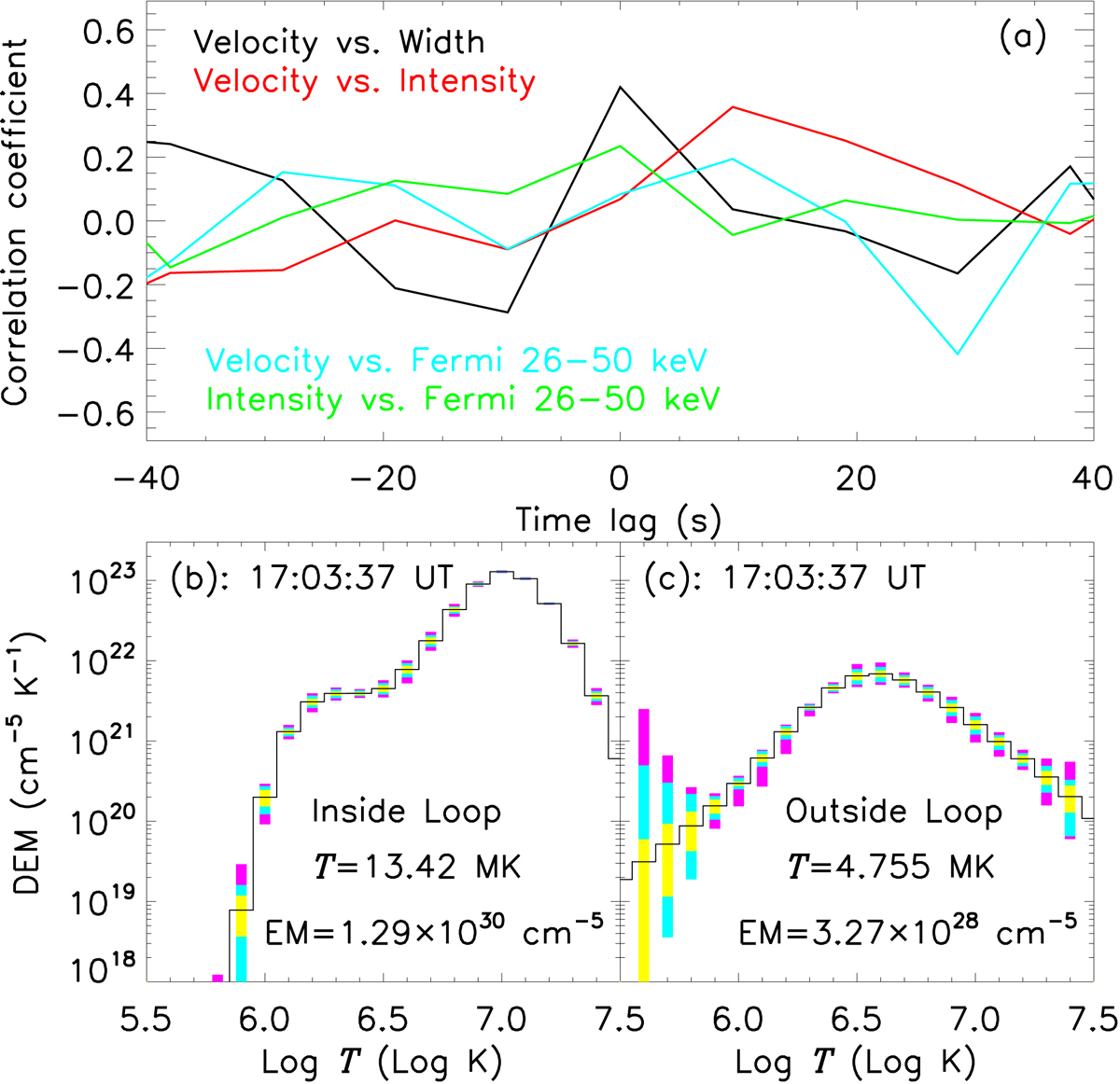
Cross-correlation and DEM analysis results. Panel a: correlation coefficient (cc) between two parameters as a function of time lag. (panels b and c): DEM profiles in the flaring loop (panel b) and background corona (panel c) marked by the red boxes in Fig. 1. The black profile is the best-fitted DEM curve from AIA observations. The rectangles with different colors on the DEM plot encompass 95% (purple), 80% (turquoise), and 50% (yellow) of the Monte Carlo solutions, respectively. The mean temperature, EM, and observed time are labeled in each panel.
Current usage metrics show cumulative count of Article Views (full-text article views including HTML views, PDF and ePub downloads, according to the available data) and Abstracts Views on Vision4Press platform.
Data correspond to usage on the plateform after 2015. The current usage metrics is available 48-96 hours after online publication and is updated daily on week days.
Initial download of the metrics may take a while.