Fig. 3.
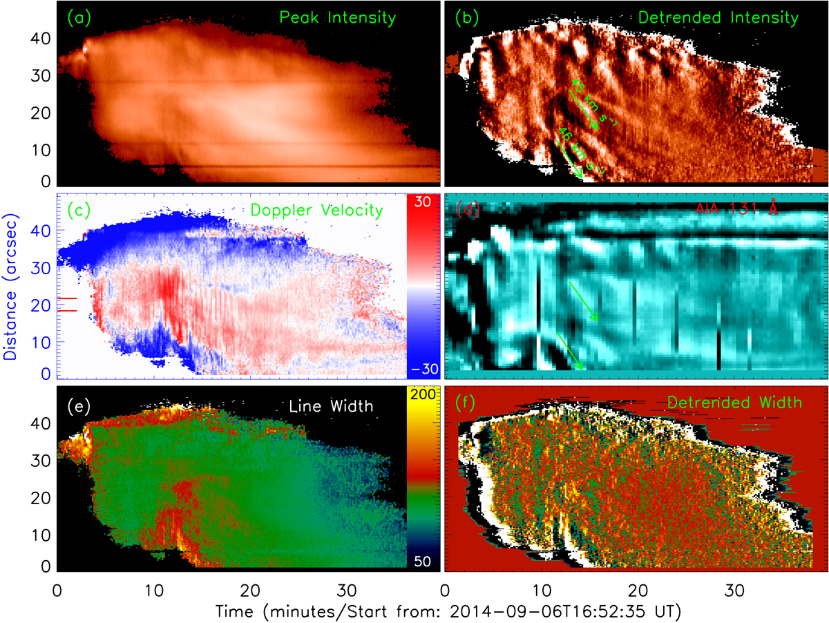
Time-distance plot. Left: the peak intensity image (panel a) is shown in logarithmic scale, while the unit of color bars is shown in Doppler velocity (panel c) and line width (panel e) images in km s−1. Right: detrended images in peak intensity (panel b), AIA 131 Å intensity (panel d), and line width (panel f). Two red bars enclose the flaring loop-top region, and the green arrows indicate the propagating directions.
Current usage metrics show cumulative count of Article Views (full-text article views including HTML views, PDF and ePub downloads, according to the available data) and Abstracts Views on Vision4Press platform.
Data correspond to usage on the plateform after 2015. The current usage metrics is available 48-96 hours after online publication and is updated daily on week days.
Initial download of the metrics may take a while.