Fig. 11
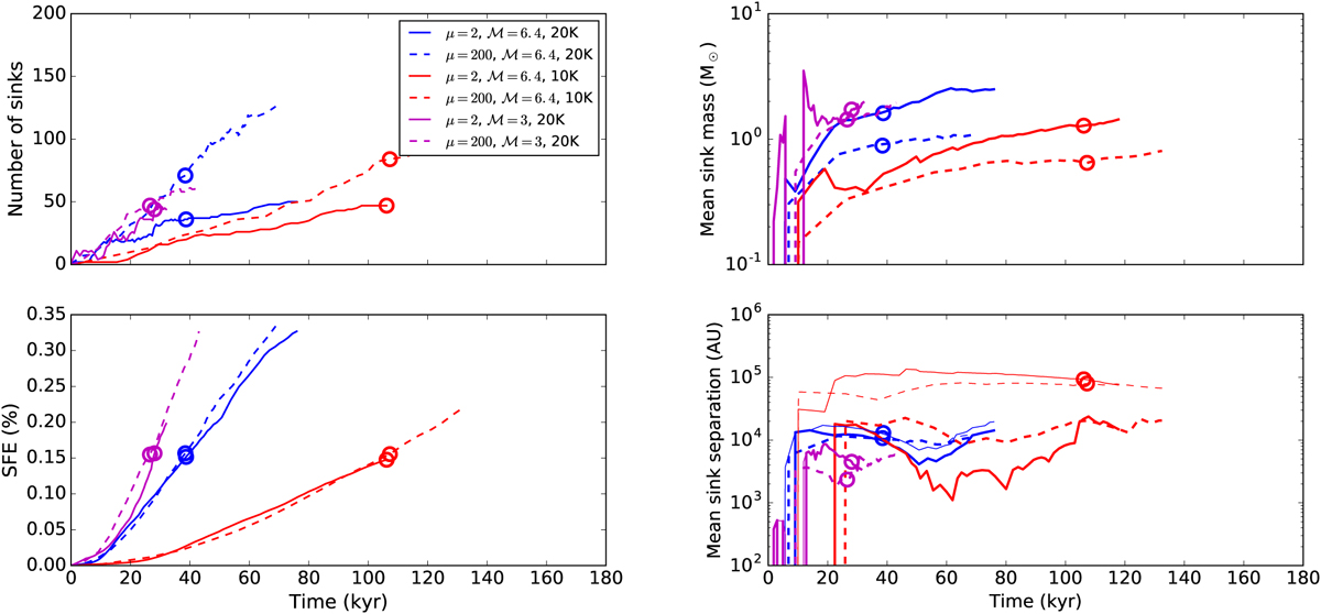
Left panel: time evolution of the number of sink particles (top panel) and of the SFE (bottom panel) for simulations (2), (3), and (4), i.e. the simulations that reproduce the collapse of a 300 M⊙ clump. The circles indicate the time at which we post-processed the simulations, which corresponds to an SFE ≃ 15%. Right panel: time evolution of the mean sink particle mass (top panel) and of the mean separation between sink particles (bottom panel). The thin lines show the mean separation calculated by accounting for the sink particles located within a sphere of radius 40 000 au around the most massive one. The dashed lines show the mean separation between all the sink particles.
Current usage metrics show cumulative count of Article Views (full-text article views including HTML views, PDF and ePub downloads, according to the available data) and Abstracts Views on Vision4Press platform.
Data correspond to usage on the plateform after 2015. The current usage metrics is available 48-96 hours after online publication and is updated daily on week days.
Initial download of the metrics may take a while.