Fig. 10
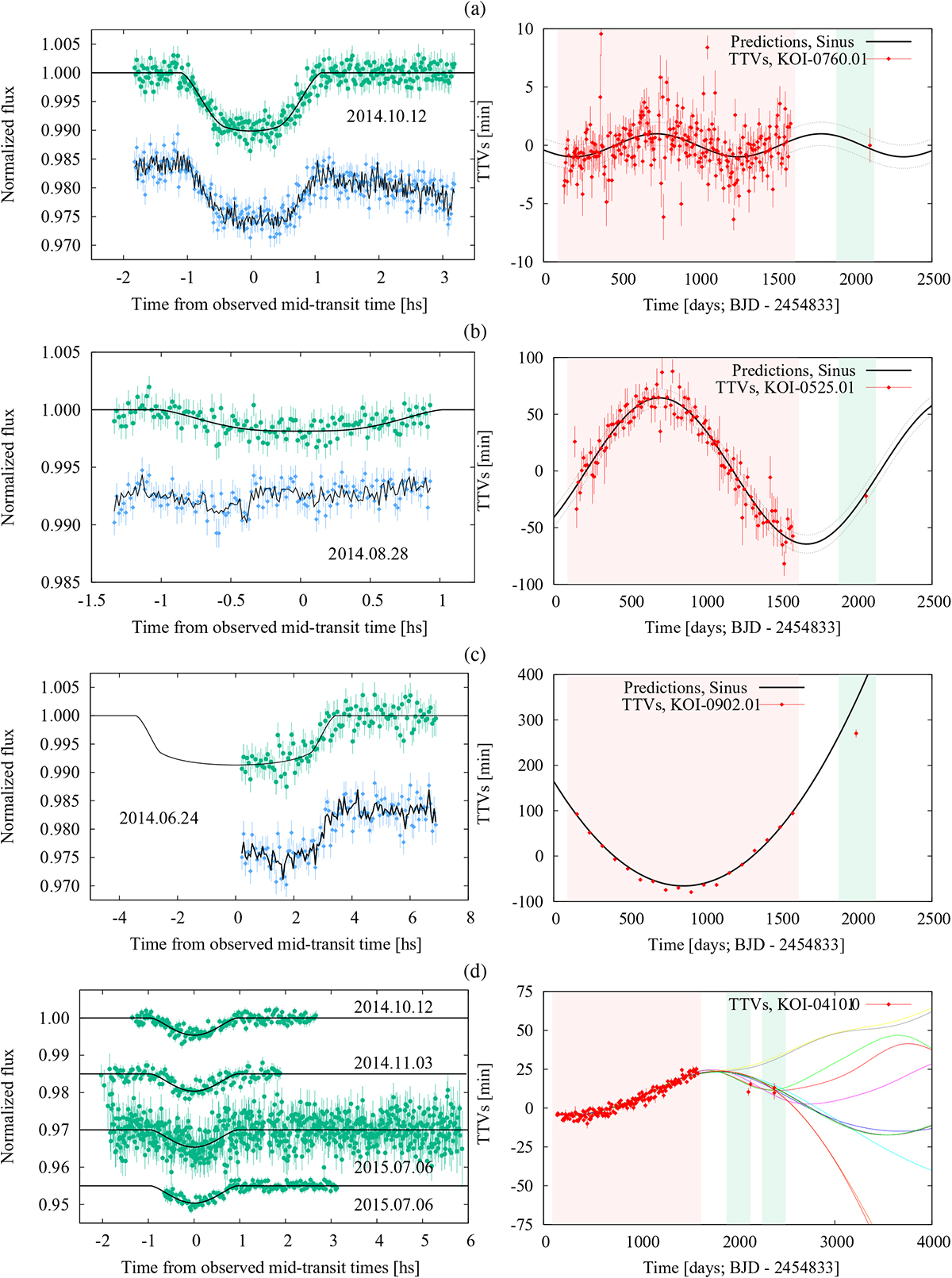
Left panels, from top to bottom: transit observations of KOI-0760.01, KOI-0525.01, KOI-0902.01, and KOI-0410.01. The data are plotted in hours with respect to their best-fit mid-transit times. In all cases green circles show detrended data, along with the best-fit model as black continuous lines. For the first three cases only, the raw data are shown as blue diamonds; the detrending times transit models are overplotted as black lines, shifted down for a better visual comparison, to exemplify our detrending strategy. Right panels: Kepler and ground-based TTVs (red diamonds) for the KOIs displayed on the left. Continuous and dashed black and colored lines indicate the predictions and uncertainties, respectively.The red shaded area represents Kepler observing time and the green shaded areas represent the 2014 and 2015 observing seasons (March–October).
Current usage metrics show cumulative count of Article Views (full-text article views including HTML views, PDF and ePub downloads, according to the available data) and Abstracts Views on Vision4Press platform.
Data correspond to usage on the plateform after 2015. The current usage metrics is available 48-96 hours after online publication and is updated daily on week days.
Initial download of the metrics may take a while.