Fig. 7
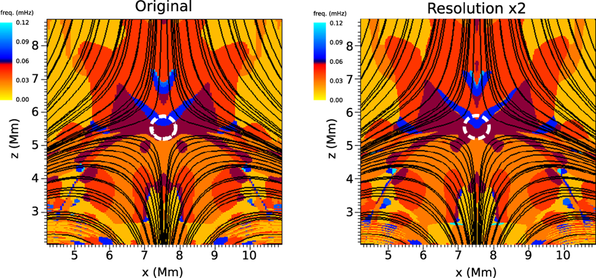
Spatial distributions of the dominant frequencies for two different grid resolutions: (left) the original simulation with 351 × 700 grid points and (right) simulation with double resolution (700 × 1400 grid points). The color map shows the frequency power. The overplotted black lines indicate the magnetic field lines and the dashed white contour shows the equipartition layer around the null point.
Current usage metrics show cumulative count of Article Views (full-text article views including HTML views, PDF and ePub downloads, according to the available data) and Abstracts Views on Vision4Press platform.
Data correspond to usage on the plateform after 2015. The current usage metrics is available 48-96 hours after online publication and is updated daily on week days.
Initial download of the metrics may take a while.