Fig. 2
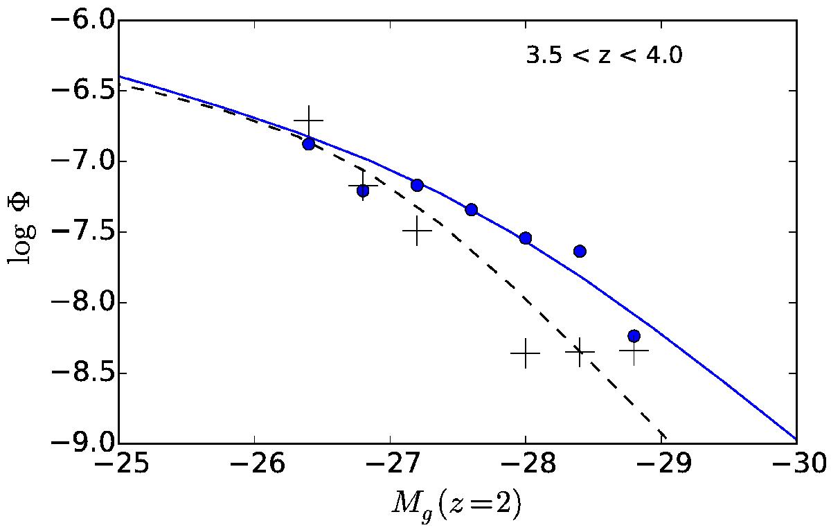
Comparison of QLFs for the redshift bin 3.5 <z< 4.0. Plus signs indicate the QLF reported by Palanque-Delabrouille et al. (2016). Filled circles show the QLF based on the corrected eBOSS dataset. The corrected QLF shows a shallower slope than the original version. The dashed curve is the best-fit PLE+LEDE model reported by Palanque-Delabrouille et al. (2016). The solid curve shows the best-fit PLE+LEDE model based on the corrected dataset.
Current usage metrics show cumulative count of Article Views (full-text article views including HTML views, PDF and ePub downloads, according to the available data) and Abstracts Views on Vision4Press platform.
Data correspond to usage on the plateform after 2015. The current usage metrics is available 48-96 hours after online publication and is updated daily on week days.
Initial download of the metrics may take a while.