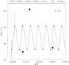
Fig. 5
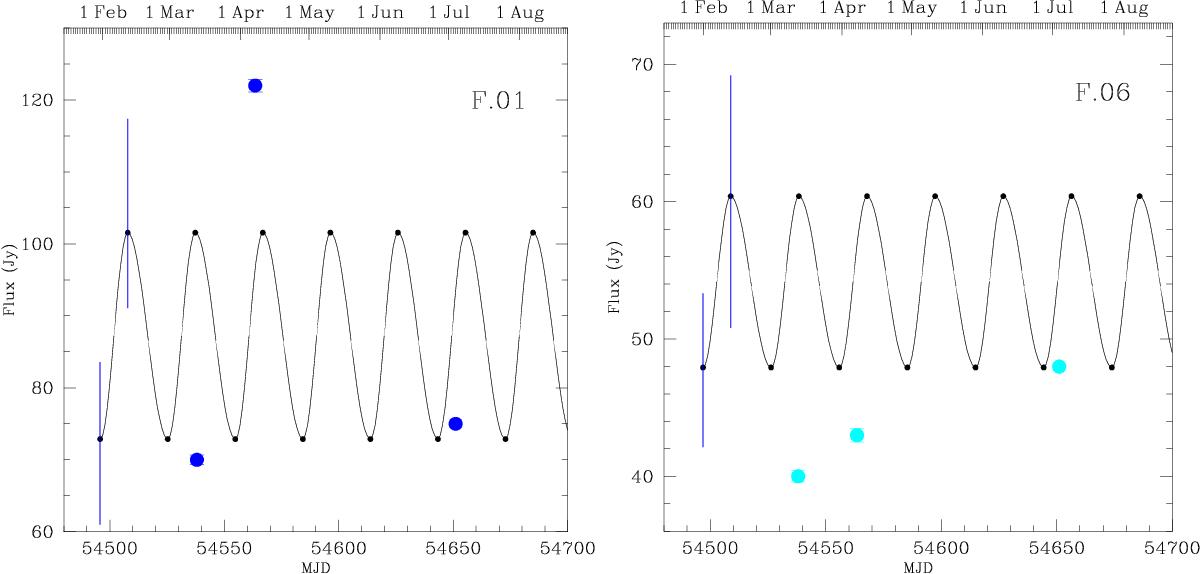
Flux density versus time for the features F.01 (left) and F.06 (right). The black curve illustrates the expected variability of the maser feature according to Goedhart et al. (2009); the predicted times of maxima and minima are reported in Table 6. The blue bars indicate the range of the intensities between the highest maximum and the lowest maximum and between the highest minimum and lowest minimum.
Current usage metrics show cumulative count of Article Views (full-text article views including HTML views, PDF and ePub downloads, according to the available data) and Abstracts Views on Vision4Press platform.
Data correspond to usage on the plateform after 2015. The current usage metrics is available 48-96 hours after online publication and is updated daily on week days.
Initial download of the metrics may take a while.