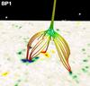
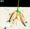
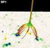
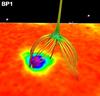
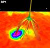
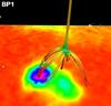
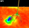
Fig. 2
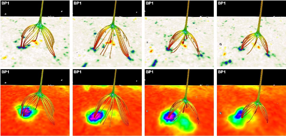
Time evolution of the BP1 case. Top row shows the evolution of the magnetogram and the corresponding potential magnetic field extrapolation. The magnetogram is scaled to ±200 G, where blue represent negative polarity and red represents positive polarity. The grey isosurface indicates the location of the magnetic null point, with the field lines being traced from the vicinity of the null region. The field line colour represents the magnetic field strength; red represents the strong field and green-blue represents the weak field. The lower row shows the same magnetic fields, while the bottom boundary represents the XRT observations shown on a linear scale, with the red being low values and purple representing the peak values. The images correspond to the times 06:38:13 UT, 08:38:05 UT, 10:38:08 UT, and 11:59:35 UT (left to right) on 2007 November 9. The included online animation shows the time evolution.
Current usage metrics show cumulative count of Article Views (full-text article views including HTML views, PDF and ePub downloads, according to the available data) and Abstracts Views on Vision4Press platform.
Data correspond to usage on the plateform after 2015. The current usage metrics is available 48-96 hours after online publication and is updated daily on week days.
Initial download of the metrics may take a while.