Fig. 2
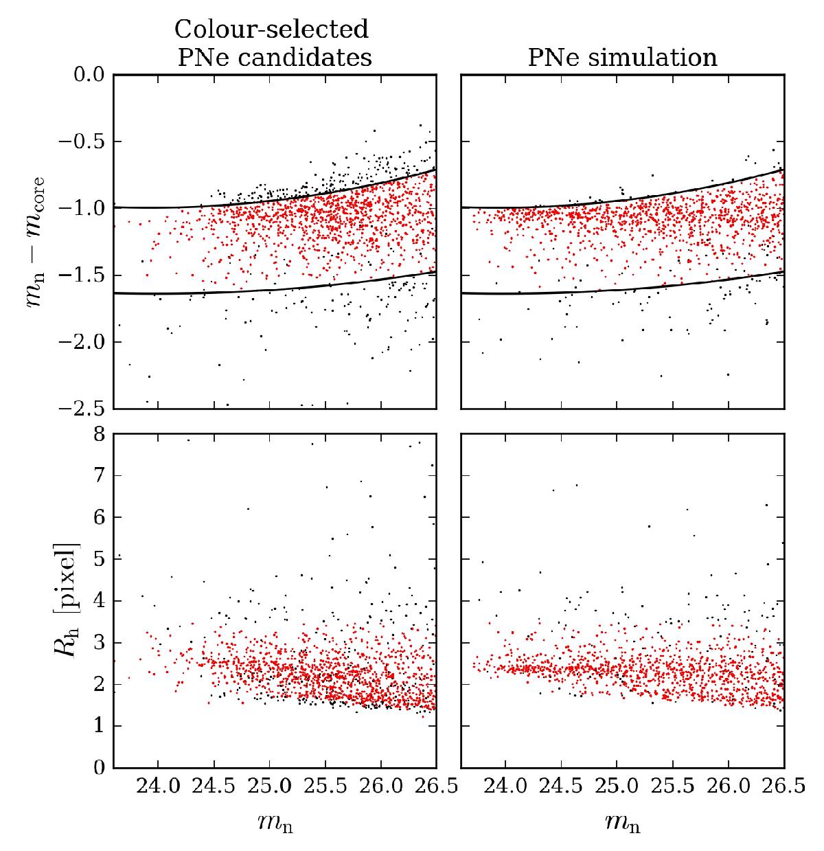
Point-source test left column: colour-selected PNe; right column: simulated PN-population. Top row: mn − mcore vs. mn, the black lines indicate the region in which 95% of the simulated population fall. Bottom row: Rh as a function of mn. We impose a limit of 3.5 pixel on Rh, such that 95% of the simulated population is included. Objects which satisfy both criteria are plotted in red and are termed point-like.
Current usage metrics show cumulative count of Article Views (full-text article views including HTML views, PDF and ePub downloads, according to the available data) and Abstracts Views on Vision4Press platform.
Data correspond to usage on the plateform after 2015. The current usage metrics is available 48-96 hours after online publication and is updated daily on week days.
Initial download of the metrics may take a while.