Fig. 12
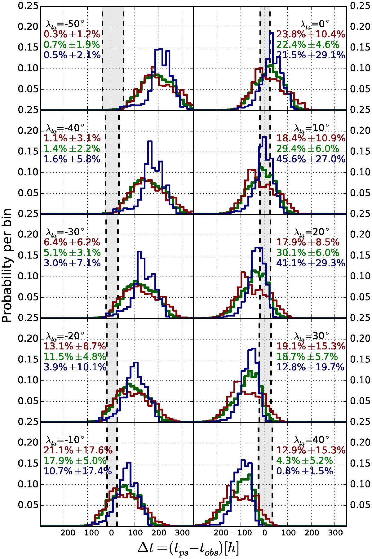
Results for the leading stripe mapping. The x axis shows the time difference Δt = tps − tobs between the time when a source region is observed by the spectrograph and when it releases its solar wind package. The y axis shows the probability per bin. The red curves show only source regions with a measured solar wind speed below 350 km s-1, the green curves represent intermediate speeds from 350 km s-1 to 600 km s-1 and the blue curves with speeds above 600 km s-1. Each panel shows the result for a different leading angle. The dashed vertical lines mark the area where a source regions would be observed at the moment of the solar wind’s release. The colored numbers show Γoc in percent with the corresponding errors. The errors are the statistical errors originating from the variation between individual CRs.
Current usage metrics show cumulative count of Article Views (full-text article views including HTML views, PDF and ePub downloads, according to the available data) and Abstracts Views on Vision4Press platform.
Data correspond to usage on the plateform after 2015. The current usage metrics is available 48-96 hours after online publication and is updated daily on week days.
Initial download of the metrics may take a while.