Fig. 4
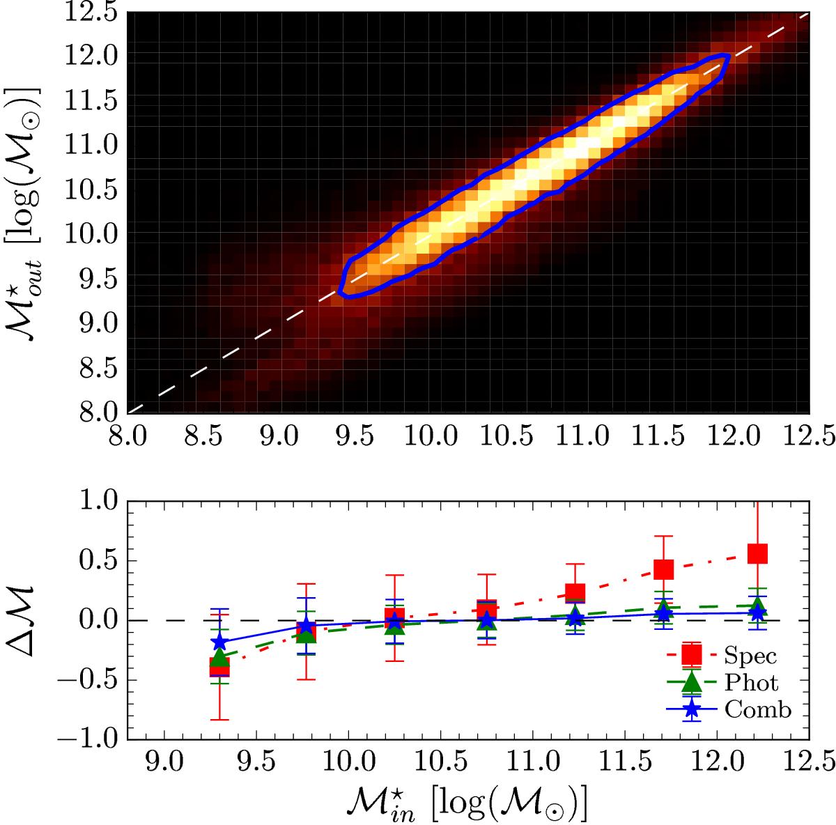
Comparison of the stellar mass measurements ![]() obtained using GOSSIP+ on the 180 000 simulated
obtained using GOSSIP+ on the 180 000 simulated ![]() sample with the input values. Top panel: the density plot represents the measurement of M⋆ from the combined fit versus the input M⋆. The highest density is represented by the brightest colour, while the lowest density is represented in black. The blue line represents the 1σ contour of the distribution. The combined fit is able to find the correct M⋆ at any mass in the simulated range. Bottom panel: evolution of the quantity
sample with the input values. Top panel: the density plot represents the measurement of M⋆ from the combined fit versus the input M⋆. The highest density is represented by the brightest colour, while the lowest density is represented in black. The blue line represents the 1σ contour of the distribution. The combined fit is able to find the correct M⋆ at any mass in the simulated range. Bottom panel: evolution of the quantity ![]() over the stellar mass range. The points in red, green, and blue represent the fit on the spectroscopy only, photometry only and on the combined data, respectively. The combined fit leads to the most accurate M⋆ computation with ΔM⋆< 0.1 dex.
over the stellar mass range. The points in red, green, and blue represent the fit on the spectroscopy only, photometry only and on the combined data, respectively. The combined fit leads to the most accurate M⋆ computation with ΔM⋆< 0.1 dex.
Current usage metrics show cumulative count of Article Views (full-text article views including HTML views, PDF and ePub downloads, according to the available data) and Abstracts Views on Vision4Press platform.
Data correspond to usage on the plateform after 2015. The current usage metrics is available 48-96 hours after online publication and is updated daily on week days.
Initial download of the metrics may take a while.