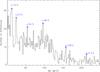
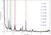
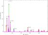
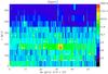
Fig. 5
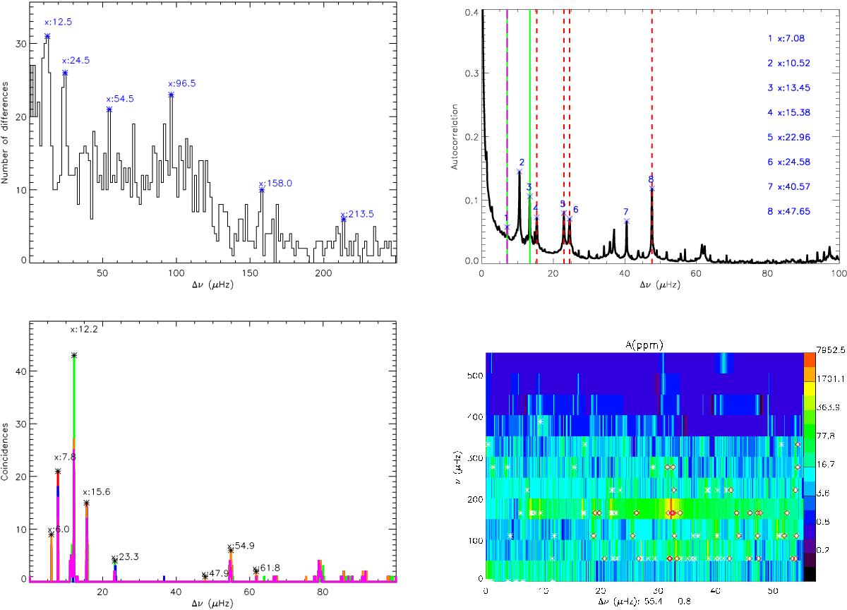
Top left panel: histogram of differences of CID 546 modes. Top right panel: autocorrelation function of CID 546 power spectra. Red dashed lines point to the large separation or one of its split peaks and its submultiples. Purple long-dashed line point to the splitting calculated by the difference between the supposed large separation and the nearest peak. This difference coincides with the rotational signature found and its double both marked with green solid lines. Bottom left panel: histogram of coincidences for possible regularities in CID 546 power spectrum (red). Other colours point to the coincidences achieved with an artificial spectrum built taking into account different number of highest amplitude peaks (I): 50 (green), 100 (blue), 250 (orange), and all detected peaks (purple). Bottom right panel: echelle diagram for CID 546 power spectra using a periodicity of 55.4 μHz. White asterisks correspond to the highest amplitude modes and red diamonds represent those consecutive modes that are aligned. Notice the logarithmic scale for the amplitude axis.
Current usage metrics show cumulative count of Article Views (full-text article views including HTML views, PDF and ePub downloads, according to the available data) and Abstracts Views on Vision4Press platform.
Data correspond to usage on the plateform after 2015. The current usage metrics is available 48-96 hours after online publication and is updated daily on week days.
Initial download of the metrics may take a while.