Fig. 1
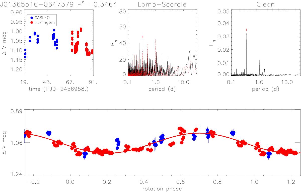
Results of periodogram analysis of 2MASS J01365516-0647379. In the top left panel we plot magnitudes vs. heliocentric Julian Day. Different colors are used to distinguish data collected at CASLEO from data collected at HAO. In the top middle panel we plot the Lomb-Scargle periodogram with the spectral window function and power level corresponding to FAP = 1% (horizontal dashed line) overplotted (red dotted line), and we indicate the peak corresponding to the rotation period. In the top right panel we plot the CLEAN periodogram. In the bottom panel we plot the light curve phased with the rotation period. The solid line represents the sinusoidal fit.
Current usage metrics show cumulative count of Article Views (full-text article views including HTML views, PDF and ePub downloads, according to the available data) and Abstracts Views on Vision4Press platform.
Data correspond to usage on the plateform after 2015. The current usage metrics is available 48-96 hours after online publication and is updated daily on week days.
Initial download of the metrics may take a while.