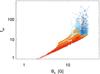
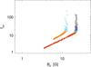
Fig. 7
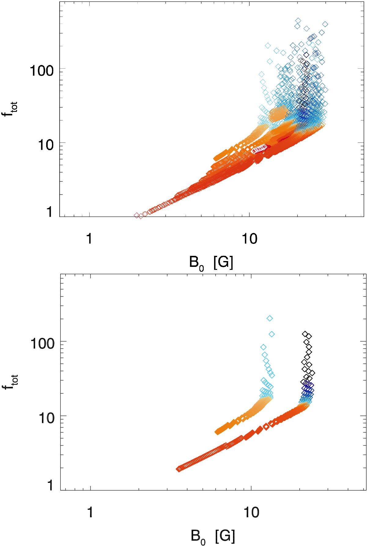
Scatter-plots of the total flux-tube expansion rate as a function of the magnetic field strength at the surface. The top panel represent these quantities calculated from our simulations for an 11 yr period. The points are colour-coded according to the speed attained by the wind flow in each flux-tube (orange represents fast wind, blue represents slow wind). The bottom panel represents only the simulation data points relative to the minimum and to the maximum (first and third panels in Fig. 5).
Current usage metrics show cumulative count of Article Views (full-text article views including HTML views, PDF and ePub downloads, according to the available data) and Abstracts Views on Vision4Press platform.
Data correspond to usage on the plateform after 2015. The current usage metrics is available 48-96 hours after online publication and is updated daily on week days.
Initial download of the metrics may take a while.