Fig. 5
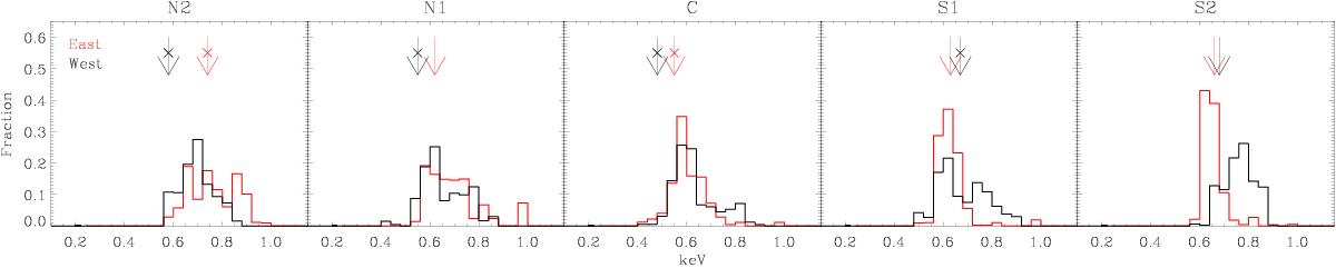
Comparison of the two-temperature analyses. The histograms show the distributions of the 1T fits of the temperature map within each rectangular extraction region, weighted by the SPEX normalizations per arcsec. The arrows indicate the best-fit values obtained in the 2T fitting cycle. The crossed arrows show the best-fit values of the emission-weighted temperatures of the two CIE component models, while the arrows without the crosses mark the values of the fits reduced in the 1T model.
Current usage metrics show cumulative count of Article Views (full-text article views including HTML views, PDF and ePub downloads, according to the available data) and Abstracts Views on Vision4Press platform.
Data correspond to usage on the plateform after 2015. The current usage metrics is available 48-96 hours after online publication and is updated daily on week days.
Initial download of the metrics may take a while.