Fig. 3
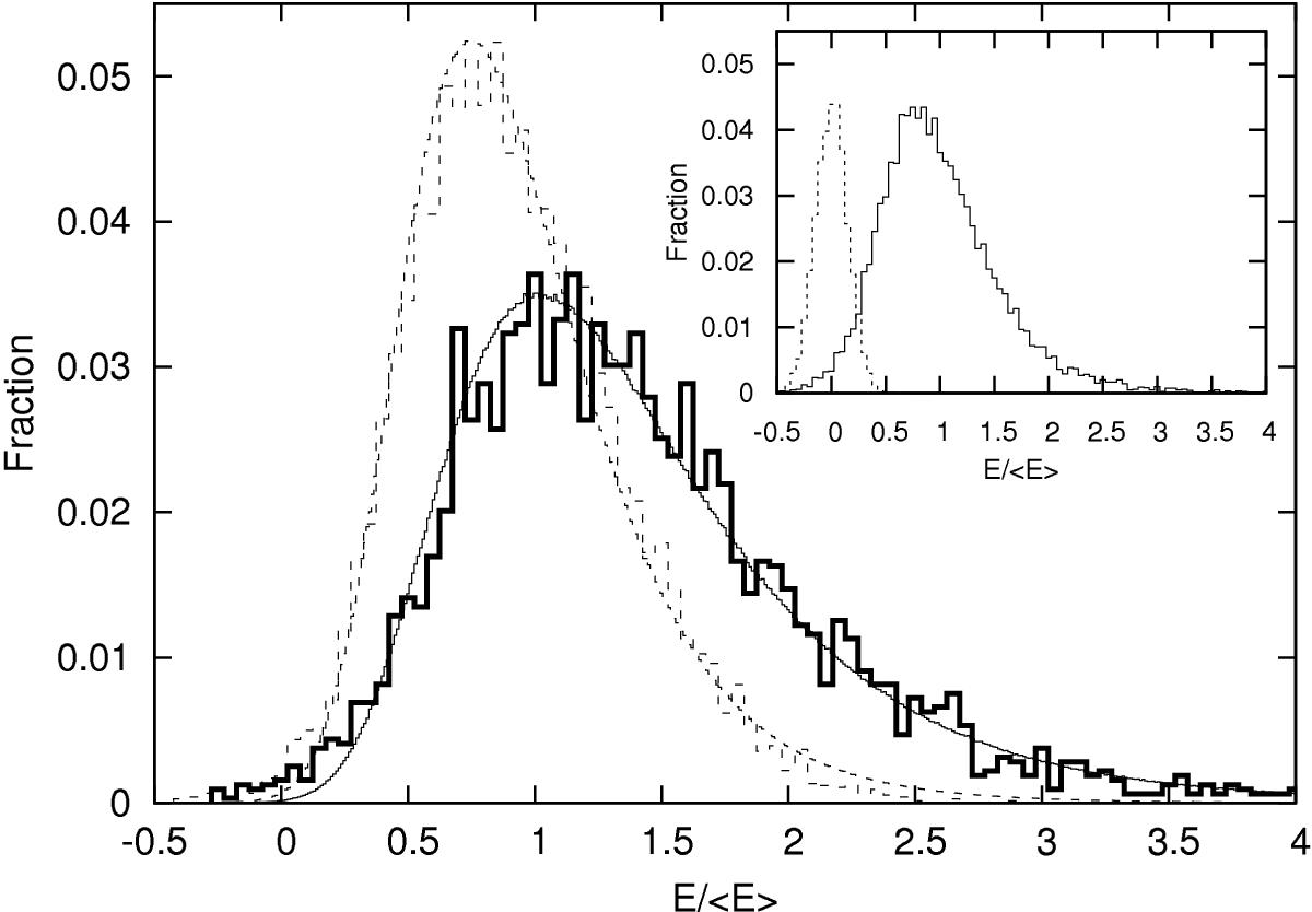
Inset: the normalised pulse energy distribution of the combined 2005 data sets (solid histogram), and that of the off-pulse region (dotted histogram). The latter is scaled down by a factor three to make their amplitudes comparable. Main panel: the similarly normalised energy distribution of the Q (thin dashed histogram) and B mode (thick solid distribution) are shown separately. The fitted distribution functions are shown as the thin solid (B mode) and dashed curve (Q mode).
Current usage metrics show cumulative count of Article Views (full-text article views including HTML views, PDF and ePub downloads, according to the available data) and Abstracts Views on Vision4Press platform.
Data correspond to usage on the plateform after 2015. The current usage metrics is available 48-96 hours after online publication and is updated daily on week days.
Initial download of the metrics may take a while.