Fig. 3
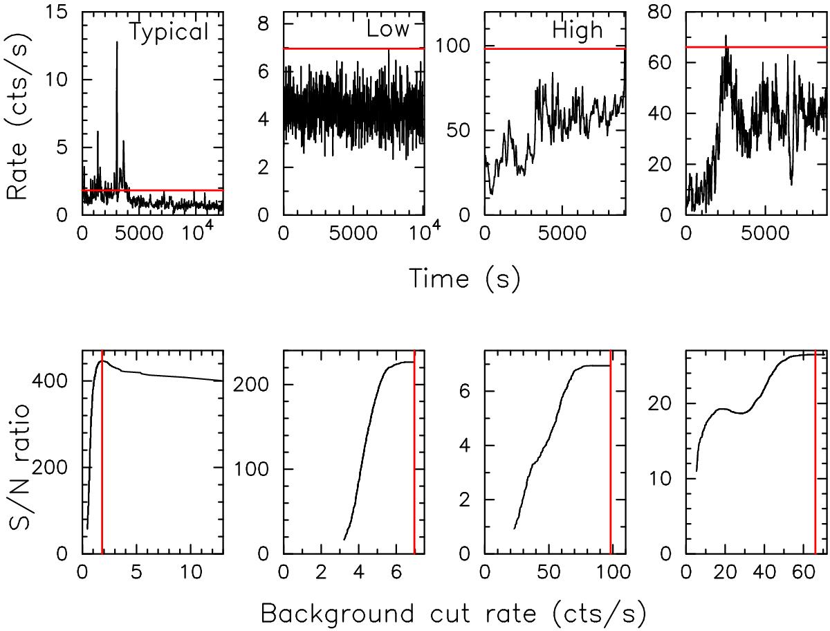
Flare background light curves (top row) and their corresponding S/N vs. background cut threshold plots (bottom row). The leftmost panels are for a typical observation with notable background flaring. The second pair of vertically aligned panels shows an example where the background has a persistently low level, while the third pair of panels reflects an example where the background is persistently high. The rightmost panels show an example of a variable background which gives rise to a double-peaked S/N vs. background-rate-cut curve. The vertical red lines in the lower panels indicate the optimum background-cut-threshold (i.e. the peak of the curve) derived for the light curves in the top panels. In the upper panels the applied optimum cut-rate is also shown in red as horizontal lines.
Current usage metrics show cumulative count of Article Views (full-text article views including HTML views, PDF and ePub downloads, according to the available data) and Abstracts Views on Vision4Press platform.
Data correspond to usage on the plateform after 2015. The current usage metrics is available 48-96 hours after online publication and is updated daily on week days.
Initial download of the metrics may take a while.