Fig. 5
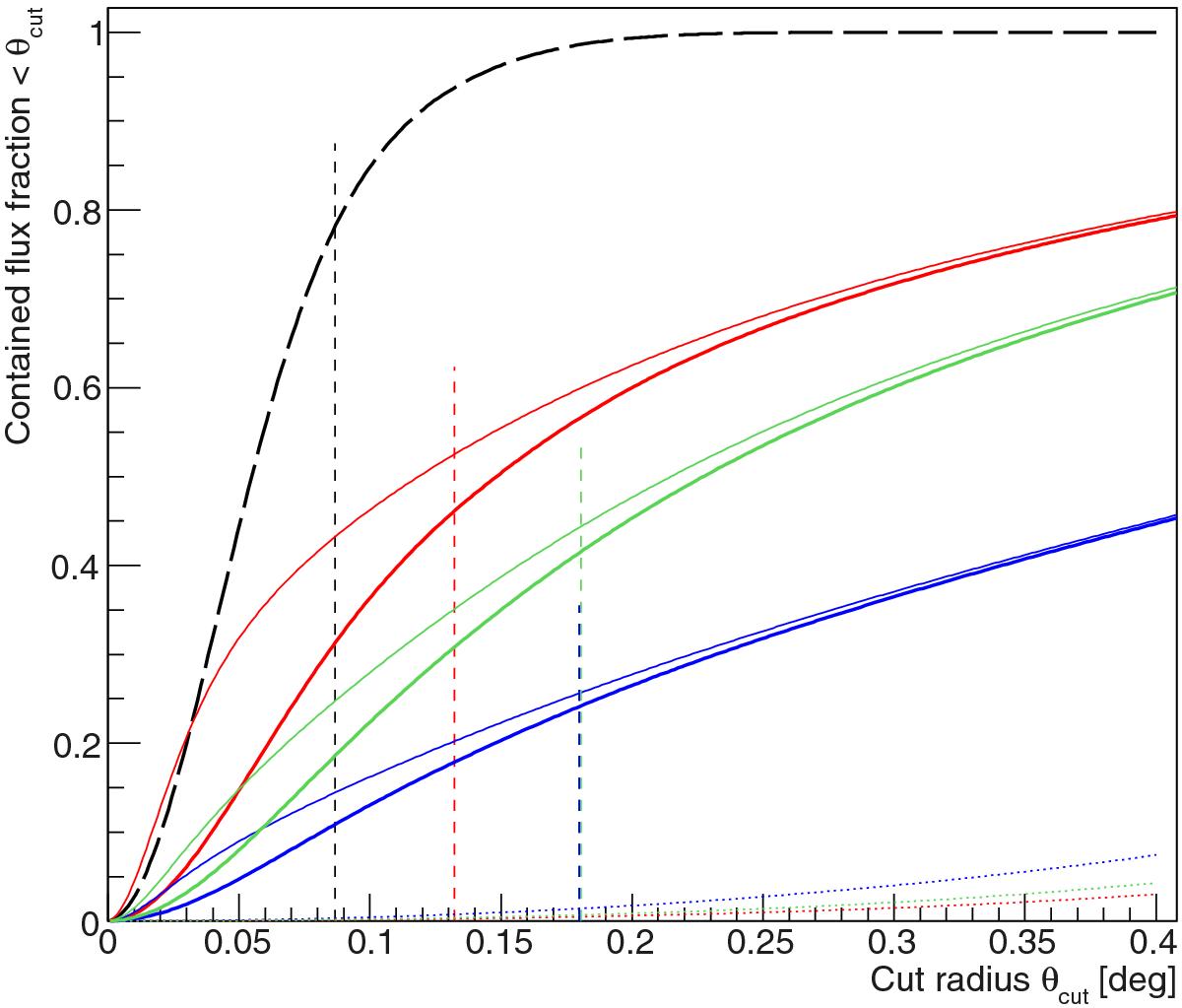
Cumulative fraction of signal within a given radius for different models: point-like in black (long-dashed line), isobaric in green, semi-analytical in red, and extended in blue. The distribution of the point-like model follows the MAGIC PSF above 630 GeV. The thin and thick coloured solid lines represent the real and reconstructed (i.e., smeared by the PSF) signal fractions, respectively. The dotted lines represent the fraction of these signals contained in the reference background region. The vertical dashed lines correspond to the used optimum θcut values.
Current usage metrics show cumulative count of Article Views (full-text article views including HTML views, PDF and ePub downloads, according to the available data) and Abstracts Views on Vision4Press platform.
Data correspond to usage on the plateform after 2015. The current usage metrics is available 48-96 hours after online publication and is updated daily on week days.
Initial download of the metrics may take a while.