Fig. 5
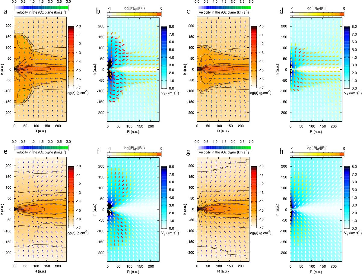
Top row: ![]() , aligned case, snapshots at a time t = 1.02 tfree - fall (500 years after first core formation). Panel a) shows a map of the density in the ideal MHD simulation. The black solid lines are logarithmically spaced density contours. The arrows represent the velocity field where blue to green corresponds to the increasing magnitude of the velocity in the (r,z) plane. Panel b) is a map of the Alfvén speed (blue), with the magnetic field direction in the (r,z) plane indicated by the segments. Yellow to red in these segments corresponds to increasing relative magnitude of the toroidal component of the field compared to the total field. Panels c) and d) are the same as a) and b), respectively, but for the niMHD case. Bottom row: same as the top row for μ = 2, and at the same time t = 1.01 tfree - fall (500 years after first core formation). Every quantity is azimuthally averaged.
, aligned case, snapshots at a time t = 1.02 tfree - fall (500 years after first core formation). Panel a) shows a map of the density in the ideal MHD simulation. The black solid lines are logarithmically spaced density contours. The arrows represent the velocity field where blue to green corresponds to the increasing magnitude of the velocity in the (r,z) plane. Panel b) is a map of the Alfvén speed (blue), with the magnetic field direction in the (r,z) plane indicated by the segments. Yellow to red in these segments corresponds to increasing relative magnitude of the toroidal component of the field compared to the total field. Panels c) and d) are the same as a) and b), respectively, but for the niMHD case. Bottom row: same as the top row for μ = 2, and at the same time t = 1.01 tfree - fall (500 years after first core formation). Every quantity is azimuthally averaged.
Current usage metrics show cumulative count of Article Views (full-text article views including HTML views, PDF and ePub downloads, according to the available data) and Abstracts Views on Vision4Press platform.
Data correspond to usage on the plateform after 2015. The current usage metrics is available 48-96 hours after online publication and is updated daily on week days.
Initial download of the metrics may take a while.