Fig. 1
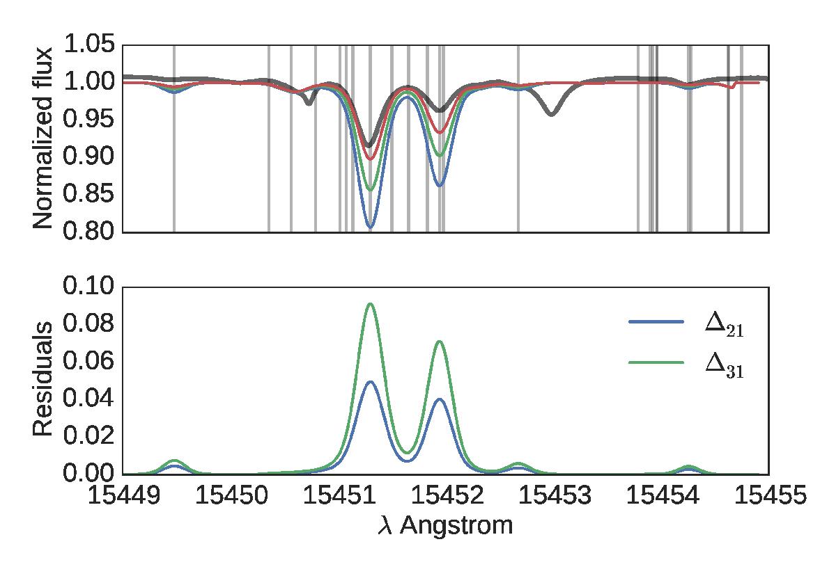
Top panel: observed spectra in grey, while the coloured curves are synthetic spectra with increasing iron abundance as the two central lines get deeper. The iron abundance varies by a total of 0.4 dex. The vertical lines show all the places where there are iron lines in the line list. Bottom panel: the two curves show the difference between the first synthetic spectrum and the second (Δ21) and between the first synthetic spectrum and the third (Δ31); this highlights where the change in iron abundance has an impact.
Current usage metrics show cumulative count of Article Views (full-text article views including HTML views, PDF and ePub downloads, according to the available data) and Abstracts Views on Vision4Press platform.
Data correspond to usage on the plateform after 2015. The current usage metrics is available 48-96 hours after online publication and is updated daily on week days.
Initial download of the metrics may take a while.