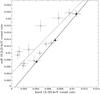
Fig. 6
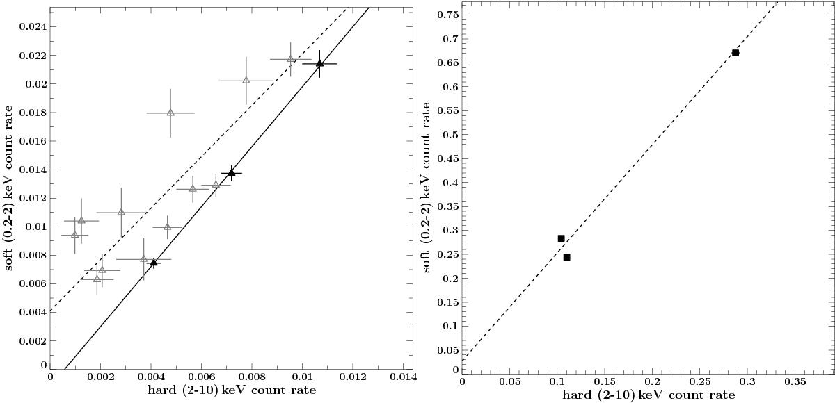
Left: hard- versus soft-band diagram (HSD): comparison of the count rates in the soft (0.2–2) keV and hard (2–10) keV band. Error bars correspond to 1-sigma uncertainties. Lines denote the best fit of the linear regression for low- (dashed) and high-S/N (solid) data. Left: results from Swift observations. Individual observations are shown as gray open symbols, while filled symbols denote results from merged data sets. Right: HSD of the XMM-Newton data. Dashed line shows the best fit of the linear regression.
Current usage metrics show cumulative count of Article Views (full-text article views including HTML views, PDF and ePub downloads, according to the available data) and Abstracts Views on Vision4Press platform.
Data correspond to usage on the plateform after 2015. The current usage metrics is available 48-96 hours after online publication and is updated daily on week days.
Initial download of the metrics may take a while.