Fig. 6
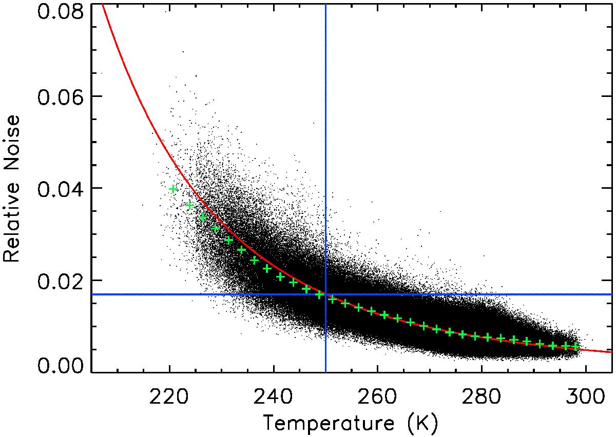
Noise parameter vs. temperature scatter plot: each black dot represents one spectrum. The red curve represents the expected noise as a function of temperature, obtained with the theoretical relation between the surface temperature and the given radiance noise, while the green crosses mark the average of the noise parameter distribution. The two blue lines denote the noise and temperature limits used for spectra selection.
Current usage metrics show cumulative count of Article Views (full-text article views including HTML views, PDF and ePub downloads, according to the available data) and Abstracts Views on Vision4Press platform.
Data correspond to usage on the plateform after 2015. The current usage metrics is available 48-96 hours after online publication and is updated daily on week days.
Initial download of the metrics may take a while.