Fig. 1
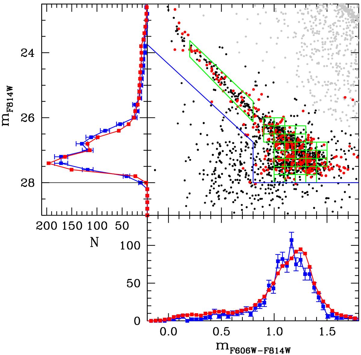
White dwarf luminosity function, color–magnitude diagram, and color distribution of NGC 6397 for our best-fit model. Gray dots represent observed main-sequence stars, black dots correspond to white dwarfs, while red points denote the results of our simulations. The green squares represent the regions of the color–magnitude diagram for which we peformed a χ2 test, while the blue thin lines correspond to the cuts adopted to compute the distributions. The red curves correspond to the simulated distributions, while the blue curves are the observed distributions computed using our cuts. See the online edition of the journal for a color version of this figure and the main text for additional details.
Current usage metrics show cumulative count of Article Views (full-text article views including HTML views, PDF and ePub downloads, according to the available data) and Abstracts Views on Vision4Press platform.
Data correspond to usage on the plateform after 2015. The current usage metrics is available 48-96 hours after online publication and is updated daily on week days.
Initial download of the metrics may take a while.