Fig. 5
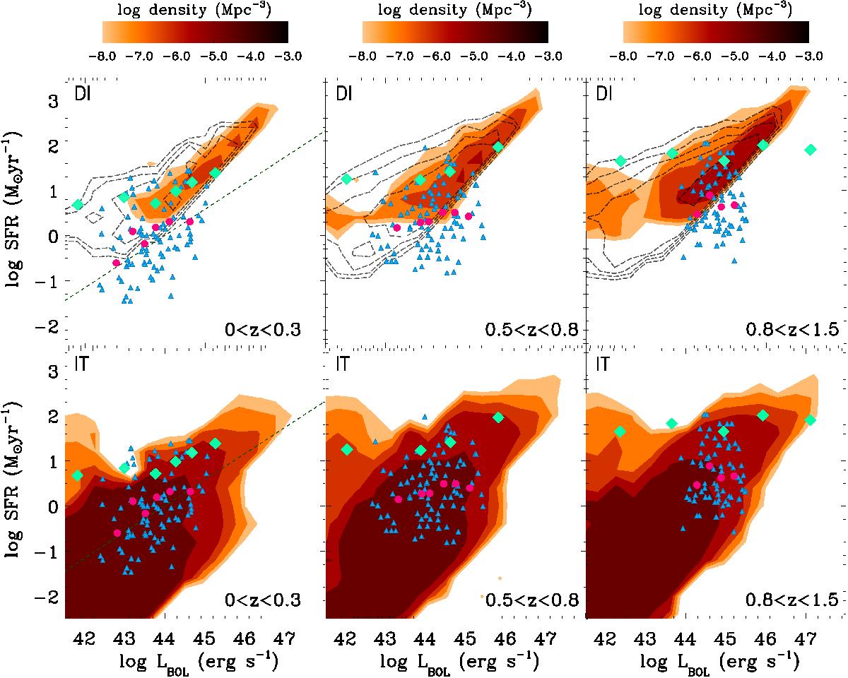
SFR versus Lbol for three different redshift bins. The upper panels refer to the DI scenario, the lower to the IT mode. The contour plot represents the AGN number density (per Mpc3) as predicted by the model. The predictions for α = 2 for the DI scenario are represented by the dashed contour plot. The dashed line is the relation obtained by Netzer (2009); pale-blue diamonds are the observational results from Rosario et al. (2012). Blue triangles are data points from Azadi et al. (2014), with purple circles representing median SFR values in different luminosity bins.
Current usage metrics show cumulative count of Article Views (full-text article views including HTML views, PDF and ePub downloads, according to the available data) and Abstracts Views on Vision4Press platform.
Data correspond to usage on the plateform after 2015. The current usage metrics is available 48-96 hours after online publication and is updated daily on week days.
Initial download of the metrics may take a while.