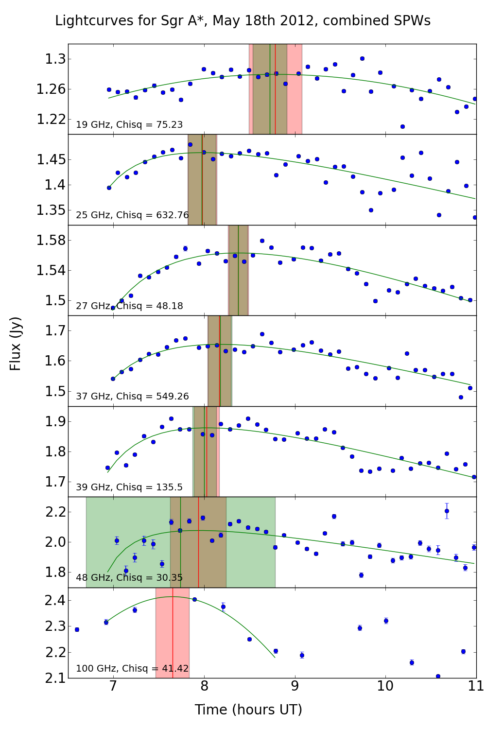
Fig. 1
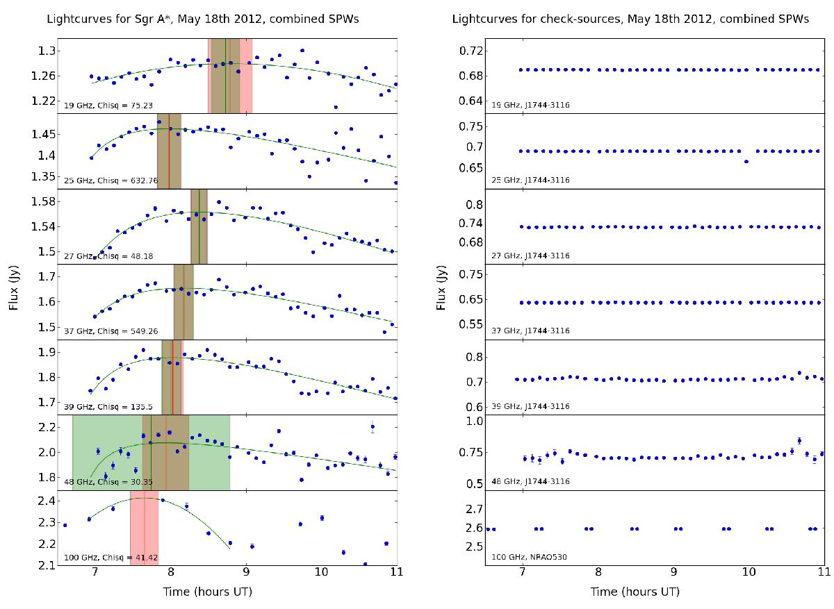
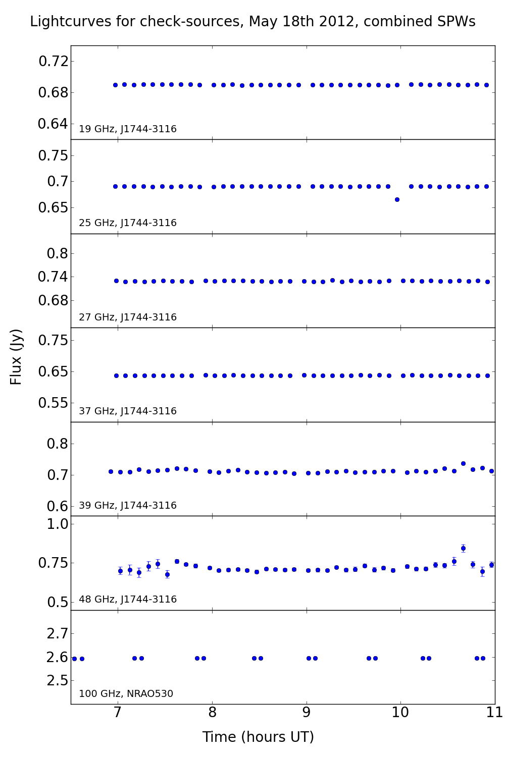
Left: flux vs. time of Sgr A* for the VLA data (top six graphs) and the 100 GHz ALMA data (bottom graph). The fitted FRED function is plotted as a green (gray) curve, the position of the maxima is plotted as a vertical red (dark gray) line with the uncertainty in the fit superimposed as a red-shaded (dark gray) region. Green-shaded (light gray) regions indicate the uncertainty on the fits obtained by randomly dropping half of the data points for 500 iterations – see Sect. 3 for details. Right: flux vs. time for the calibrator sources (J1744-3116 for the VLA data, NRAO530 for the ALMA data).
Current usage metrics show cumulative count of Article Views (full-text article views including HTML views, PDF and ePub downloads, according to the available data) and Abstracts Views on Vision4Press platform.
Data correspond to usage on the plateform after 2015. The current usage metrics is available 48-96 hours after online publication and is updated daily on week days.
Initial download of the metrics may take a while.