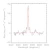
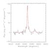
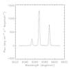
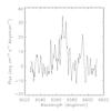
Fig. D.1
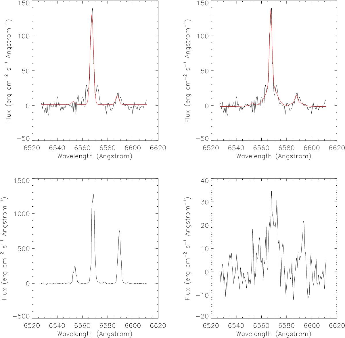
Example spectrum taken from one of the clumps. Plots 1 and 2 show spectra taken from just inside one of the clumps, where the FWHM map shows that the lines are narrow, but are located near to the broad region seen at the edge of the clumps. Plots 3 and 4 are spectra taken from the centre of one of the clumps and the broad boundary region seen in the FWHM map. Note that plots 1 and 2 show a narrow line dominating the profile with a FWHM similar to that seen from the centre of the clumps (plot 3), but the line broadens significantly at a flux lower than ~30 erg cm-2 s-1 Å-1. This broad base is more consistent with the FWHM of the boundary region (plot 4). The red line in plots 1 and 2 shows the best-fit single-component model (plot 1) and the best-fit model with a second broad component added at the same velocity (plot 2). The two-component model clearly provides a better fit to the line, suggesting that the broad emission from the edge of the clumps is present here, but is much less significant than the narrow-line emission from the clump. We interpret this as evidence of a shocked shell of gas surrounding a much greater mass of unshocked gas within the centre of the clumps.
Current usage metrics show cumulative count of Article Views (full-text article views including HTML views, PDF and ePub downloads, according to the available data) and Abstracts Views on Vision4Press platform.
Data correspond to usage on the plateform after 2015. The current usage metrics is available 48-96 hours after online publication and is updated daily on week days.
Initial download of the metrics may take a while.