Fig. 3
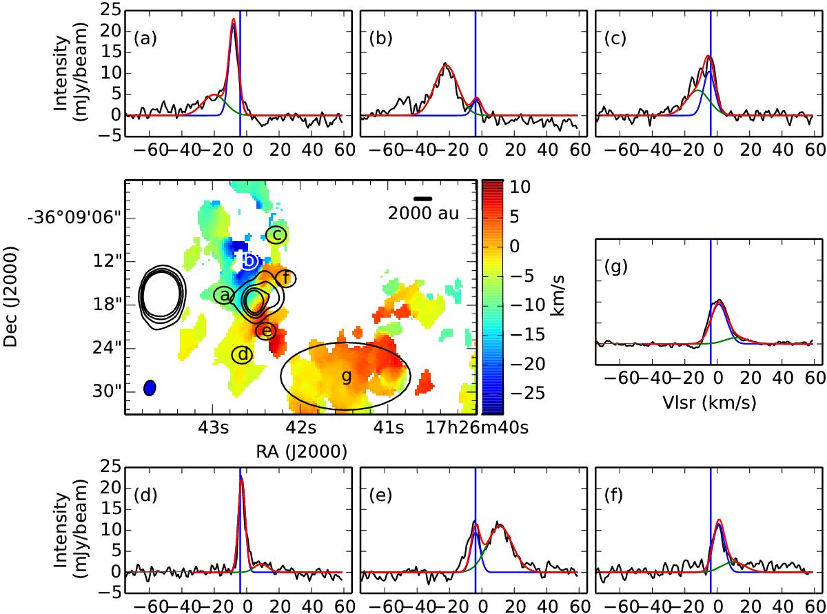
Colour scale in the central panel shows the SiO intensity weighted velocity map as in Fig. 2. The seven ellipses (labelled a)–g)) shown in this middle panel correspond to the regions over which the spectra in the correspondingly labelled panels were averaged. The vertical blue line in each spectral panel corresponds to the Vlsr of the source (−3.4 km s-1). The blue and green curves in these panels correspond to the narrow, low velocity (blue) and broad, high velocity (green) components of the outflow, both red and blue shifted from the rest velocity. The red curves show the sum of the broad and narrow components.
Current usage metrics show cumulative count of Article Views (full-text article views including HTML views, PDF and ePub downloads, according to the available data) and Abstracts Views on Vision4Press platform.
Data correspond to usage on the plateform after 2015. The current usage metrics is available 48-96 hours after online publication and is updated daily on week days.
Initial download of the metrics may take a while.