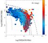
Fig. 2
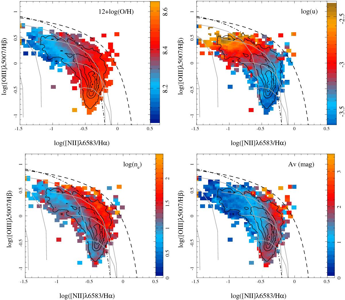
[O iii] λ5007/Hβ vs. [N ii] λ6583/Hα diagnostic diagram for the ~5000 H ii regions included in our sample. The contours show the density distribution of these regions within the diagram plane, with the outermost contour enclosing 95% of the regions and each consecutive one enclosing 20% fewer regions. In each panel the color indicates the average value at the corresponding location in the diagram for one of the four parameters described in the text: top left panel: oxygen abundance; top-right panel: ionization parameter; bottom left panel: electron density; and bottom right panel: dust attenuation. In all panels, the dot-dashed and dashed lines represent, respectively, the demarcation curves described in Fig.1, and the gray solid lines represent the expected line ratios derived from the photoionization models shown in Fig. 1, where each line corresponds to a different stellar metallicity (orange-to-red solid lines in Fig. 1).
Current usage metrics show cumulative count of Article Views (full-text article views including HTML views, PDF and ePub downloads, according to the available data) and Abstracts Views on Vision4Press platform.
Data correspond to usage on the plateform after 2015. The current usage metrics is available 48-96 hours after online publication and is updated daily on week days.
Initial download of the metrics may take a while.