Fig. 8
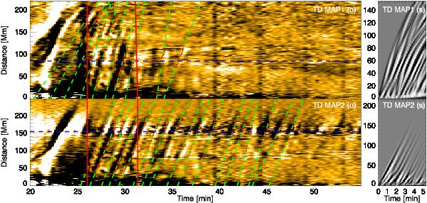
Time–distance maps from the observations (left) and from the numerical simulation (right). The red dots are the data points that indicate the position of the wave fronts, fitted by the green lines. The vertical continuous red lines delimit a temporal window of about 5 min from the flare peak for comparison with the numerical simulation. Intensity time series are extracted from the maps at position marked by the dashed blue lines, which are plotted in Fig. 9.
Current usage metrics show cumulative count of Article Views (full-text article views including HTML views, PDF and ePub downloads, according to the available data) and Abstracts Views on Vision4Press platform.
Data correspond to usage on the plateform after 2015. The current usage metrics is available 48-96 hours after online publication and is updated daily on week days.
Initial download of the metrics may take a while.