Fig. 3
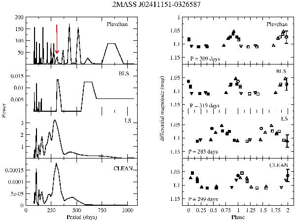
Periodograms (left panels) and phased curves corresponding to their most significant peaks (right panels) for J0241-0326. In the phased curves, different symbol shapes indicate data points corresponding to the different cycles, while filled and open symbols of the same shape correspond to duplicated data points. The typical error bar is shown for the last data point. The red arrow in the upper left panel indicates the peak in best agreement with the highest peak in the rest of periodograms (see text for discussion).
Current usage metrics show cumulative count of Article Views (full-text article views including HTML views, PDF and ePub downloads, according to the available data) and Abstracts Views on Vision4Press platform.
Data correspond to usage on the plateform after 2015. The current usage metrics is available 48-96 hours after online publication and is updated daily on week days.
Initial download of the metrics may take a while.