Fig. 7
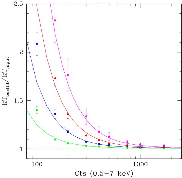
Ratio of the best-fit over input temperature for our set of simulations, as a function of the total net counts in the 0.5–7 keV band. From top to bottom: magenta solid dots correspond to kT = 7.5 keV; red dots to 5 keV; blue dots to 3 keV; green dots to 1.5 keV. The corresponding lines show the best fit to the temperature bias function R(T,cts) (see Eq. (1)).
Current usage metrics show cumulative count of Article Views (full-text article views including HTML views, PDF and ePub downloads, according to the available data) and Abstracts Views on Vision4Press platform.
Data correspond to usage on the plateform after 2015. The current usage metrics is available 48-96 hours after online publication and is updated daily on week days.
Initial download of the metrics may take a while.