Fig. A.1
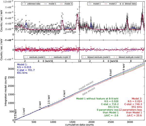
Comparison of the background data from Source 318 with background models. The best model is shown in blue, while the red model has several features removed (see text in Appendix A). In the top two panels, the usual count spectrum is shown with residuals (left unbinned, right binned to at least 20 counts per bin). In the large, bottom panel we present the corresponding Q–Q (quantile-quantile) plot. For each energy E, the model counts predicted and the counts observed below E are recorded on the plot. The grey dashed line is where data and model would perfectly agree. Model 1 (blue solid top line) follows this line very closely, and thus can be considered a good model. Model 2 (red solid bottom line) deviates from the grey dashed line at 2 keV, indicating that a feature in the data may be missing in the model. The shape and size of the deviation also indicates the shape of the needed feature. The significance of the feature can be tested using model selection. Here, the AIC shows that the feature at 2−2.5 keV is necessary ΔAIC > 0, but adding the more complicated feature at 8−9 keV is not (see text in Appendix A for details).
Current usage metrics show cumulative count of Article Views (full-text article views including HTML views, PDF and ePub downloads, according to the available data) and Abstracts Views on Vision4Press platform.
Data correspond to usage on the plateform after 2015. The current usage metrics is available 48-96 hours after online publication and is updated daily on week days.
Initial download of the metrics may take a while.