Fig. 18
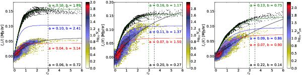
Comparison of observed and simulated NIR surface brightness Iν in J, H, and K bands as the function of optical depth in J band, τJ. WFCAM data for TMC-1N are shown with a 2D histogram, the colour scale corresponding to the density of points, and a black line shows the fitted Eq. (2). For comparison, simulated data are shown in the same figures using the three test cases described in the text. We plot the simulated data points only for case 1 (black dots). The fitted function is marked with a green line (case 1: without background), blue line (case 2: with background), and red line (case 3: with background and attenuation of the scattered light in the envelope). In J band, black dashed vertical line shows the upper limit of fitting of both WFCAM and simulation data. In H and K bands, the black dashed vertical line shows the upper limit of fitting of WFCAM data, and green dashed vertical line the upper limit of fitting of simulated data (all three cases). To get a better fit, the limit for the observations is slightly higher. The obtained parameter values are marked in the figures with the same colours as the fitted lines.
Current usage metrics show cumulative count of Article Views (full-text article views including HTML views, PDF and ePub downloads, according to the available data) and Abstracts Views on Vision4Press platform.
Data correspond to usage on the plateform after 2015. The current usage metrics is available 48-96 hours after online publication and is updated daily on week days.
Initial download of the metrics may take a while.