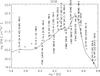
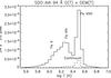
Fig. 6
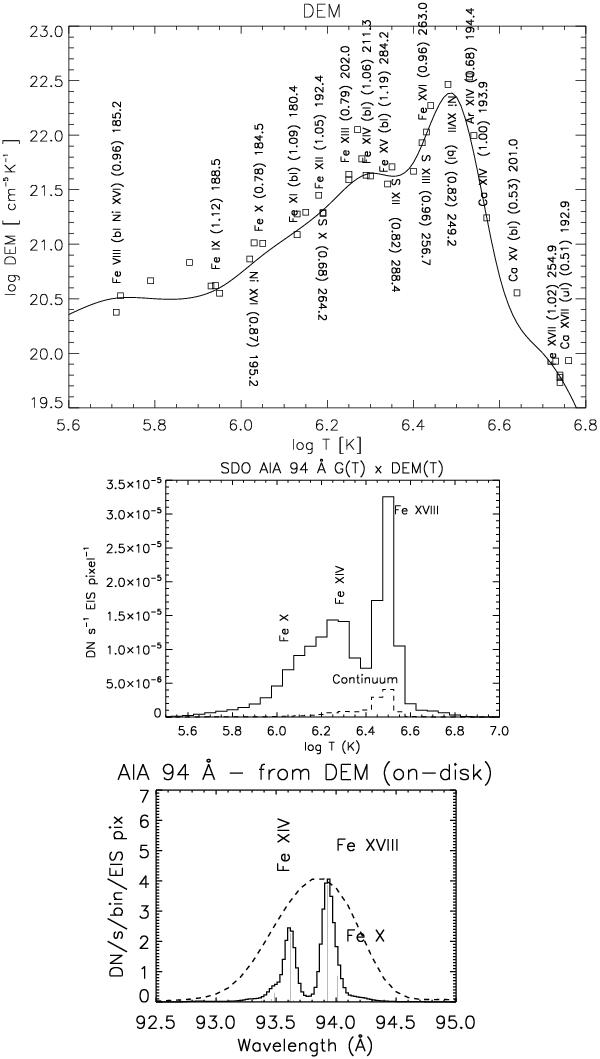
Above: DEM of the 2010 Oct. 26 active region core. The numbers in parentheses are the ratios between predicted and observed intensities. The points are plotted at the temperature Tmax, and at the theoretical vs. the observed intensity ratio multiplied by the DEM value. Below: corresponding AIA 94 Å count rates as a function of temperature and wavelength (the dashed curve is the normalised AIA effective area).
Current usage metrics show cumulative count of Article Views (full-text article views including HTML views, PDF and ePub downloads, according to the available data) and Abstracts Views on Vision4Press platform.
Data correspond to usage on the plateform after 2015. The current usage metrics is available 48-96 hours after online publication and is updated daily on week days.
Initial download of the metrics may take a while.