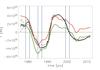
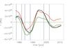
Fig. 5
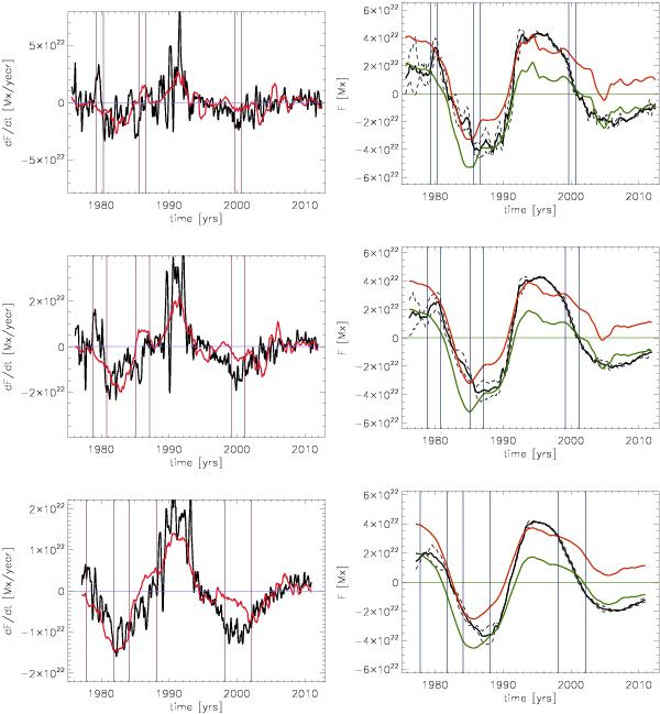
Net cross equatorial transport of magnetic flux as a function of time (left panels). The black curves show the total net flux transport, dF/dt averaged over 1 year (top panel), 2 years (middle panel), and 4 years (bottom panel). The red curves show the diffusive component of the flux transport  , see Eq. (3). The right panels show FNH, the magnetic flux in the northern hemisphere, and − FSH, the negative of the magnetic flux in the southern hemisphere (dashed curves), as well as their mean (solid black curve). For comparison the time integral of the diffusive flux is shown in red (assuming a starting value of 4 × 10²² Mx in 1976) and green (assuming a starting value of 2 × 10²² Mx). The intervals outlined by the vertical lines indicate the periods affected by the three events shown in Figs. 2–4, respectively.
Current usage metrics show cumulative count of Article Views (full-text article views including HTML views, PDF and ePub downloads, according to the available data) and Abstracts Views on Vision4Press platform.
Data correspond to usage on the plateform after 2015. The current usage metrics is available 48-96 hours after online publication and is updated daily on week days.
Initial download of the metrics may take a while.