Fig. 3
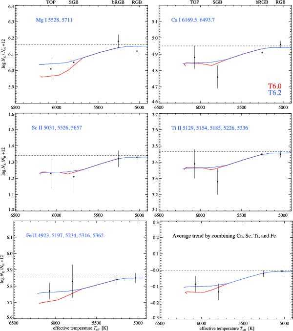
Observed abundance trends with evolutionary stage. Each point represents the abundance derived from the co-added spectra within each group as a function of Teff. The curves through the points are predictions from stellar evolution models including AD and AddMix with two different efficiencies, at 13.5 Gyr. The blue curve represents high-efficiency mixing (T0 = 6.20) while the red curve corresponds to low-efficiency mixing (T0 = 6.00). The bottom right panel shows the mean trend by normalising the observations and models for Ca, Sc, Ti and Fe to the primordial abundances given by the models and afterwards averaging these normalised observations and model trends. (This figure is available in colour in electronic form.)
Current usage metrics show cumulative count of Article Views (full-text article views including HTML views, PDF and ePub downloads, according to the available data) and Abstracts Views on Vision4Press platform.
Data correspond to usage on the plateform after 2015. The current usage metrics is available 48-96 hours after online publication and is updated daily on week days.
Initial download of the metrics may take a while.