Fig. 10
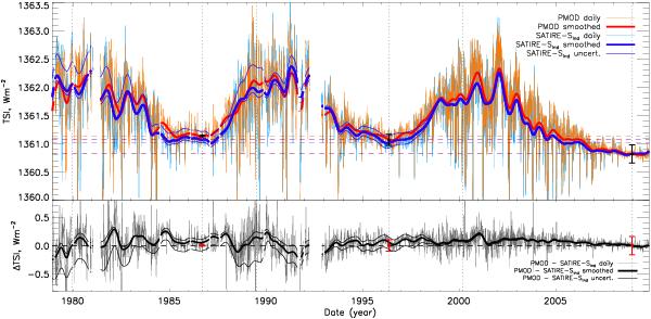
In the upper plot, PMOD (daily data, light red; smoothed, thick red line) and SATIRE-SInd (daily data, light blue; smoothed, thick blue) between 1978 and 2009 normalised to SORCE/TIM at December 2008. The thin blue lines mark the uncertainty range of SATIRE-SInd (only smoothed values plotted). In the lower plot, the difference between PMOD and SATIRE-SInd is shown (daily, grey; smoothed, black) along with the difference of the uncertainty with respect to PMOD. The black and red error bars are the errors from Fröhlich (2009) in the upper and lower plots, respectively. Dotted vertical lines indicate cycle maxima and minima. Dashed horizontal lines signifying cycle minima are plotted to aid the reader. Gaps in the curves are present when data gaps are larger than 27 days.
Current usage metrics show cumulative count of Article Views (full-text article views including HTML views, PDF and ePub downloads, according to the available data) and Abstracts Views on Vision4Press platform.
Data correspond to usage on the plateform after 2015. The current usage metrics is available 48-96 hours after online publication and is updated daily on week days.
Initial download of the metrics may take a while.