Fig. 8
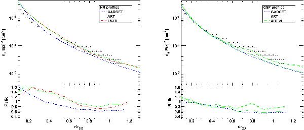
Comparison between the mean ROSAT density profile for our sample and the different sets of numerical simulations. The shaded area indicates the data and 1σ scatter as shown in Fig. 5. The bottom panels show the ratio between simulations and data as a function of radius. Left: comparison with NR simulations. The dotted red curve represents the ENZO profile (Vazza et al. 2010), the solid green curve shows the ART simulations (Nagai et al. 2007b), and the dashed blue curve is the GADGET profile (Roncarelli et al. 2006). Right: same with CSF simulations. The dashed blue line shows the GADGET simulations, while the green curves show the ART profiles, for the total density (solid) and corrected for clumping (dotted, Nagai & Lau 2011).
Current usage metrics show cumulative count of Article Views (full-text article views including HTML views, PDF and ePub downloads, according to the available data) and Abstracts Views on Vision4Press platform.
Data correspond to usage on the plateform after 2015. The current usage metrics is available 48-96 hours after online publication and is updated daily on week days.
Initial download of the metrics may take a while.