Fig. 5
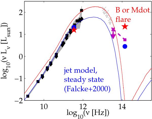
Flare model for Sgr A* from Falcke & Markoff (2000) is plotted in blue and compared to the data from July 20 (purple square for the NIR average flux during the flare time interval and purple arrow for the MIR upper limit; note that the MIR upper limit from the July 22 was lower). The red stars present the peak flux of the July 20 flare, together with the simultaneous sub-mm flux. Blue circles show the median fluxes in a non-flaring state. The radio-sub-mm SED is shown in black (with squares: the compilation of Genzel 2010, diamonds: from Shcherbakov 2011). The typical radio-sub-mm variability amplitudes and a compilation of MIR upper limits are shown in gray and taken from Melia & Falcke (2001). A flare due to a 30% increase in B in the jet model is also plotted as a red line. An increase in density resulting from a temporary increase in the accretion rate, Ṁ, has the same result (Markoff et al. 2001).
Current usage metrics show cumulative count of Article Views (full-text article views including HTML views, PDF and ePub downloads, according to the available data) and Abstracts Views on Vision4Press platform.
Data correspond to usage on the plateform after 2015. The current usage metrics is available 48-96 hours after online publication and is updated daily on week days.
Initial download of the metrics may take a while.