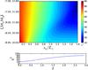
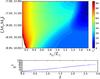
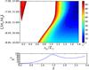
Fig. 9
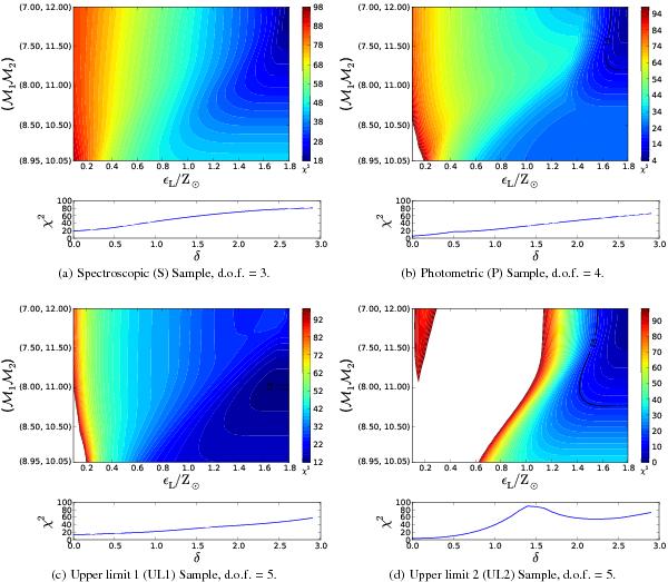
The best-fit plots for each sample investigated. Top panels: the χ2 contour plot for δ = 0, white areas denote χ2 values much larger than the colour scale shown. Only the contour of δ = 0 is displayed as the fits begin to get worse when δ starts to increase. The black lines denote the maximum χ2 to be an acceptable fit to the 1% level. Bottom panels: the χ2 values for all of the best-fits in δ space, depicting the worst fits for progressively increasing δ.
Current usage metrics show cumulative count of Article Views (full-text article views including HTML views, PDF and ePub downloads, according to the available data) and Abstracts Views on Vision4Press platform.
Data correspond to usage on the plateform after 2015. The current usage metrics is available 48-96 hours after online publication and is updated daily on week days.
Initial download of the metrics may take a while.