Free Access
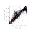
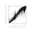
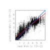
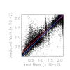
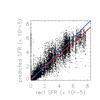
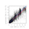
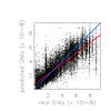
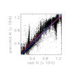
Fig. 20
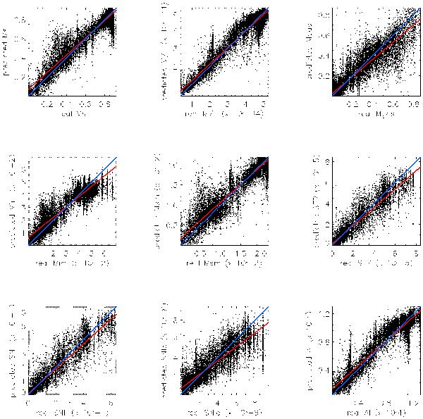
Estimation performance of output APs of the PÉGASE models. For each of the APs we plot the predicted vs. true AP values for the test set. The blue line indicates the line of perfect estimation, while the red line represents the best linear fitting for the points. The summary errors are given in Table 8.
This figure is made of several images, please see below:
Current usage metrics show cumulative count of Article Views (full-text article views including HTML views, PDF and ePub downloads, according to the available data) and Abstracts Views on Vision4Press platform.
Data correspond to usage on the plateform after 2015. The current usage metrics is available 48-96 hours after online publication and is updated daily on week days.
Initial download of the metrics may take a while.