Fig. 9
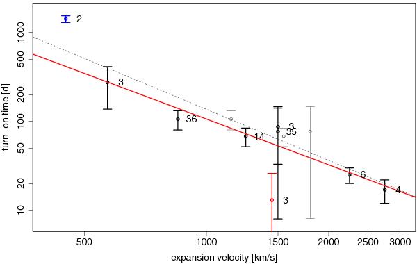
Double logarithmic plot of expansion velocity in km s-1 versus turn-on time in days after outburst including error bars. Annotations refer to the time elapsed in days between the outburst and when the optical spectrum was obtained. The red line indicates the best fit from a weighted regression. The red data point represents the atypical nova M31N 2007-10b. The blue data point is nova M31N 2003-08c for which the actual turn-on time is difficult to determine. The grey symbols visualise a generic shift of the expansion velocity by + 300 km s-1 for those novae for which spectra were taken more than ten days after outburst. The grey, dashed line shows the best fit after the shift.
Current usage metrics show cumulative count of Article Views (full-text article views including HTML views, PDF and ePub downloads, according to the available data) and Abstracts Views on Vision4Press platform.
Data correspond to usage on the plateform after 2015. The current usage metrics is available 48-96 hours after online publication and is updated daily on week days.
Initial download of the metrics may take a while.