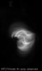
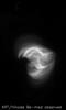
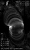
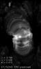
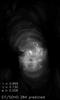
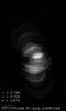
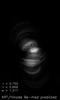
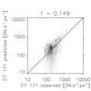
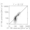
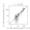
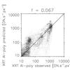
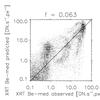
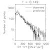
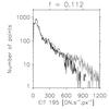
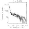
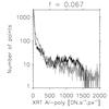
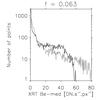
Fig. 4
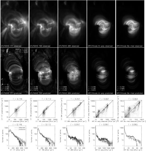
Best-fit to the observations. Top row: observations in five filters shown in linear intensity scale. Second row: predicted (synthetic) intensity images. Third row: probability density function of the predicted intensity as function of the observed intensity. Black color represents higher concentration of points. Bottom row: histograms of the observed (black line) and predicted intensity distributions (gray line). The filling factor f used to scale the predicted intensity is listed in individual graphs.
Current usage metrics show cumulative count of Article Views (full-text article views including HTML views, PDF and ePub downloads, according to the available data) and Abstracts Views on Vision4Press platform.
Data correspond to usage on the plateform after 2015. The current usage metrics is available 48-96 hours after online publication and is updated daily on week days.
Initial download of the metrics may take a while.