Fig. 2
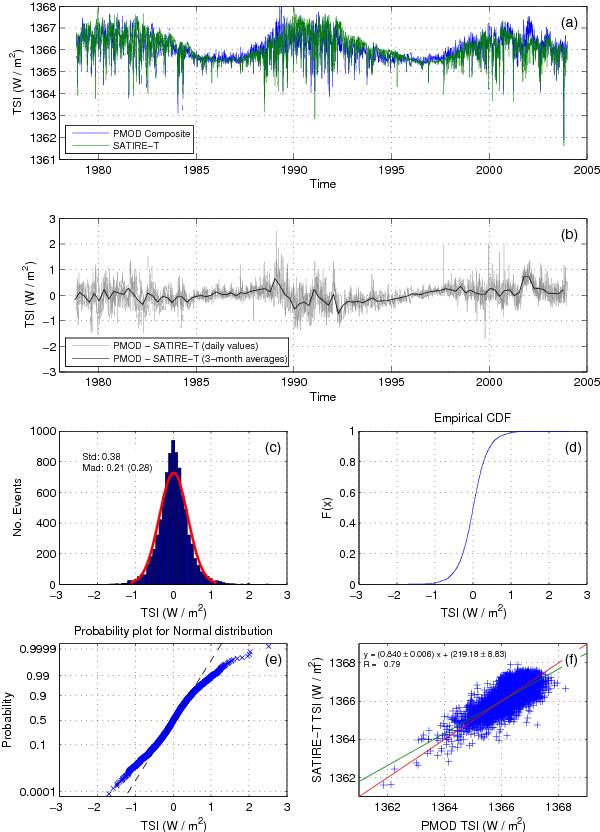
a) Comparison between the observed (PMOD Composite; blue line) and the modeled (SATIRE-T; green line) TSI from Nov./1978 to Dec./2003. b) Difference between the observed and modeled TSI. The gray and black lines present the daily and 90-day averaged values, respectively. c) Distribution of the difference between daily values of the observed and modeled TSI (model error). The standard deviation and the median absolute deviation are indicated in the panel. The red curve represents the corresponding probability distribution function for the normal distribution with the mean and standard deviation of the model error. d) Cumulative distribution function (CDF) for the difference between observed and modeled TSI. e) Probability plot for normal distribution with the mean and standard deviation of the model error. f) Scatter plot of the observed versus modeled TSI. The red line indicates the set of expectation values of the model. The correlation coefficient and the coefficients of the best linear fitting (green line) are presented in the panel. The p-value for testing the hypothesis of no correlation is lower than 0.5, which indicates that the correlation is significant.
Current usage metrics show cumulative count of Article Views (full-text article views including HTML views, PDF and ePub downloads, according to the available data) and Abstracts Views on Vision4Press platform.
Data correspond to usage on the plateform after 2015. The current usage metrics is available 48-96 hours after online publication and is updated daily on week days.
Initial download of the metrics may take a while.