Fig. A.1
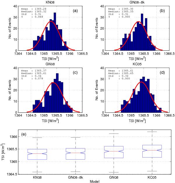
Comparison between the statistical properties of the TSI reconstructions for the period 1000 BC to 1700 AD. Panels a) to d) present the distributions of the TSI reconstructions. The mean, median and standard deviation values are indicated in the panels. The red lines represent the probability distributions functions for the normal distribution. Panel e) allows a visual comparison between the distributions. The median (red line), lower and upper quartile values of the distributions (lower and upper ends of the blue boxes) are plotted in each box. The black lines extend from the end of each box to the most extreme values within 1.5 times the interquartile range. Note that the interquartile range, which is also a measure of the statistical dispersion of the data, is equal to the difference between the third and first quartiles.
Current usage metrics show cumulative count of Article Views (full-text article views including HTML views, PDF and ePub downloads, according to the available data) and Abstracts Views on Vision4Press platform.
Data correspond to usage on the plateform after 2015. The current usage metrics is available 48-96 hours after online publication and is updated daily on week days.
Initial download of the metrics may take a while.