Fig. 5
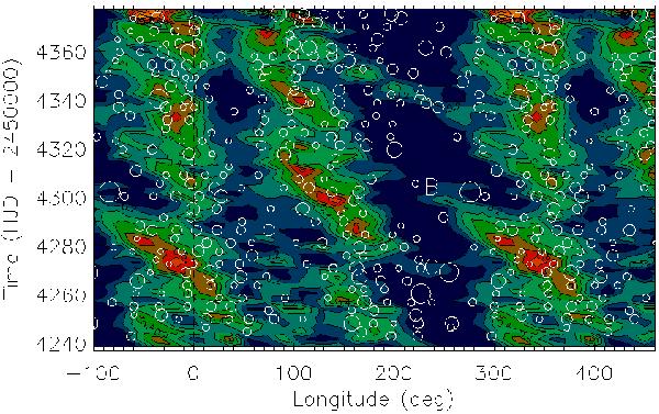
Spot longitude versus time for spots with flux deficit higher than 0.1 are shown as white circles overplotted on the map of the spot filling factor obtained by Lanza et al. (2009) from out-of-transit data (their Fig. 4). Different colours indicate different filling factors, with yellow indicating the maximum spot occupancy and dark blue the minimum. The bridges connecting active longitudes are labelled with A, B, and C (see the text).
Current usage metrics show cumulative count of Article Views (full-text article views including HTML views, PDF and ePub downloads, according to the available data) and Abstracts Views on Vision4Press platform.
Data correspond to usage on the plateform after 2015. The current usage metrics is available 48-96 hours after online publication and is updated daily on week days.
Initial download of the metrics may take a while.