Free Access
Fig. 2
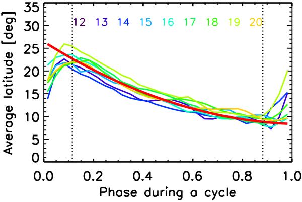
Average latitude of sunspot groups at different cycle phases. Colors indicate different cycles (cycles 12–20). The thick red curve shows the polynomial fit given by Eq. (1) to all cycles. The two vertical dotted lines indicate the times when the overlapping of cycles strongly affects the average latitudes.
Current usage metrics show cumulative count of Article Views (full-text article views including HTML views, PDF and ePub downloads, according to the available data) and Abstracts Views on Vision4Press platform.
Data correspond to usage on the plateform after 2015. The current usage metrics is available 48-96 hours after online publication and is updated daily on week days.
Initial download of the metrics may take a while.