Fig. 9
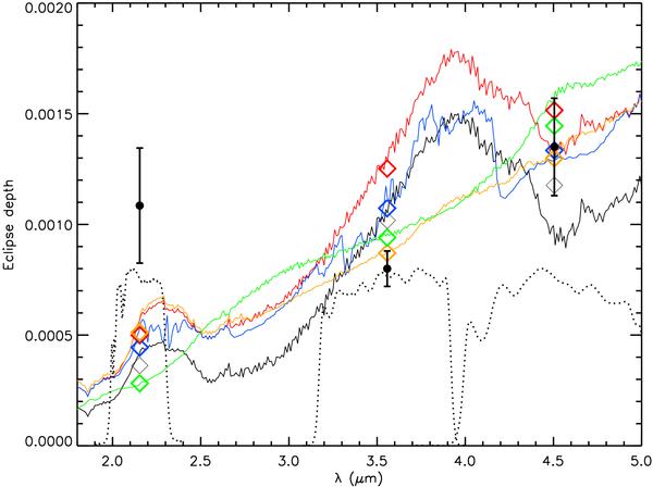
Models for the emission from the atmosphere of HAT-P-1b, for the T-P profiles of Fig. 8, using the same colour scheme. The diamonds indicate the expected flux within the observed bands for the different models. The points with errorbars indicate the observational data. The dotted lines indicate the transmission curves of the different bands. In addition, a blue (long dashed) curve is shown for an atmosphere with the same T-P profile as the red (short dashed) curve, but with a high concentration of methane and carbon-dioxide (1 × 10⁻⁴ and 2 × 10⁻⁵ respectively).
Current usage metrics show cumulative count of Article Views (full-text article views including HTML views, PDF and ePub downloads, according to the available data) and Abstracts Views on Vision4Press platform.
Data correspond to usage on the plateform after 2015. The current usage metrics is available 48-96 hours after online publication and is updated daily on week days.
Initial download of the metrics may take a while.