Fig. 3
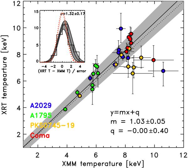
Swift-XRT and XMM-Newton temperature measurement comparison. The continuous line is the linear fit to the data, while the dotted line is the expected distribution. In the inset the scatter of the measurement is shown with the thick black line. The best fit with its uncertainties is shown with thin black lines and grey area, while the expected scatter is drawn with red dotted line.
Current usage metrics show cumulative count of Article Views (full-text article views including HTML views, PDF and ePub downloads, according to the available data) and Abstracts Views on Vision4Press platform.
Data correspond to usage on the plateform after 2015. The current usage metrics is available 48-96 hours after online publication and is updated daily on week days.
Initial download of the metrics may take a while.